Tasks App

Project Background
One of my favorite productivity apps is the Tasks app. I love writing to-do lists and being efficient, so I frequently use this app to keep lists on my phone.
For this project, I was curious to explore what feature I could add to the Tasks app to help users reach their goal of maximizing productivity. By understanding what obstacles get in the way of this goal, I was able to come up with a feature that would increase user satisfaction and ultimately increase user retention on the app.
Duration:
- 75 Hours
Tools:
- Figma
- Figjam
My Roles:
- UX Research
- UX Design
- UI Design
- Usability Testing
New Feature: Divide into Sections
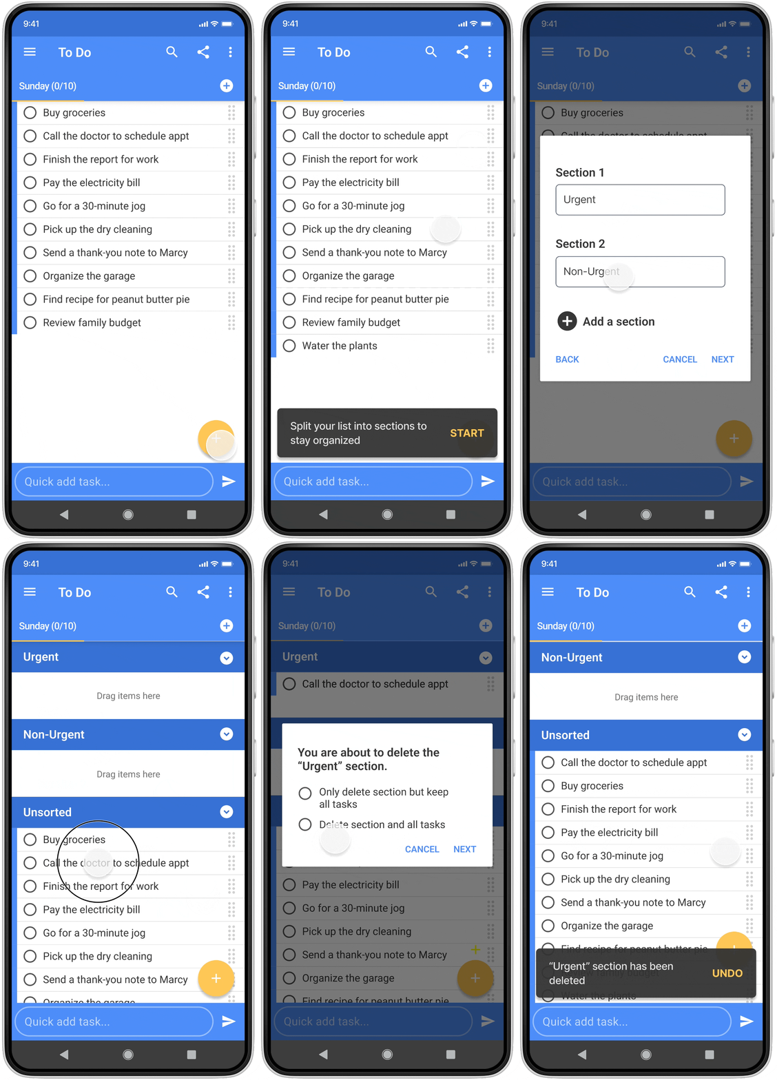
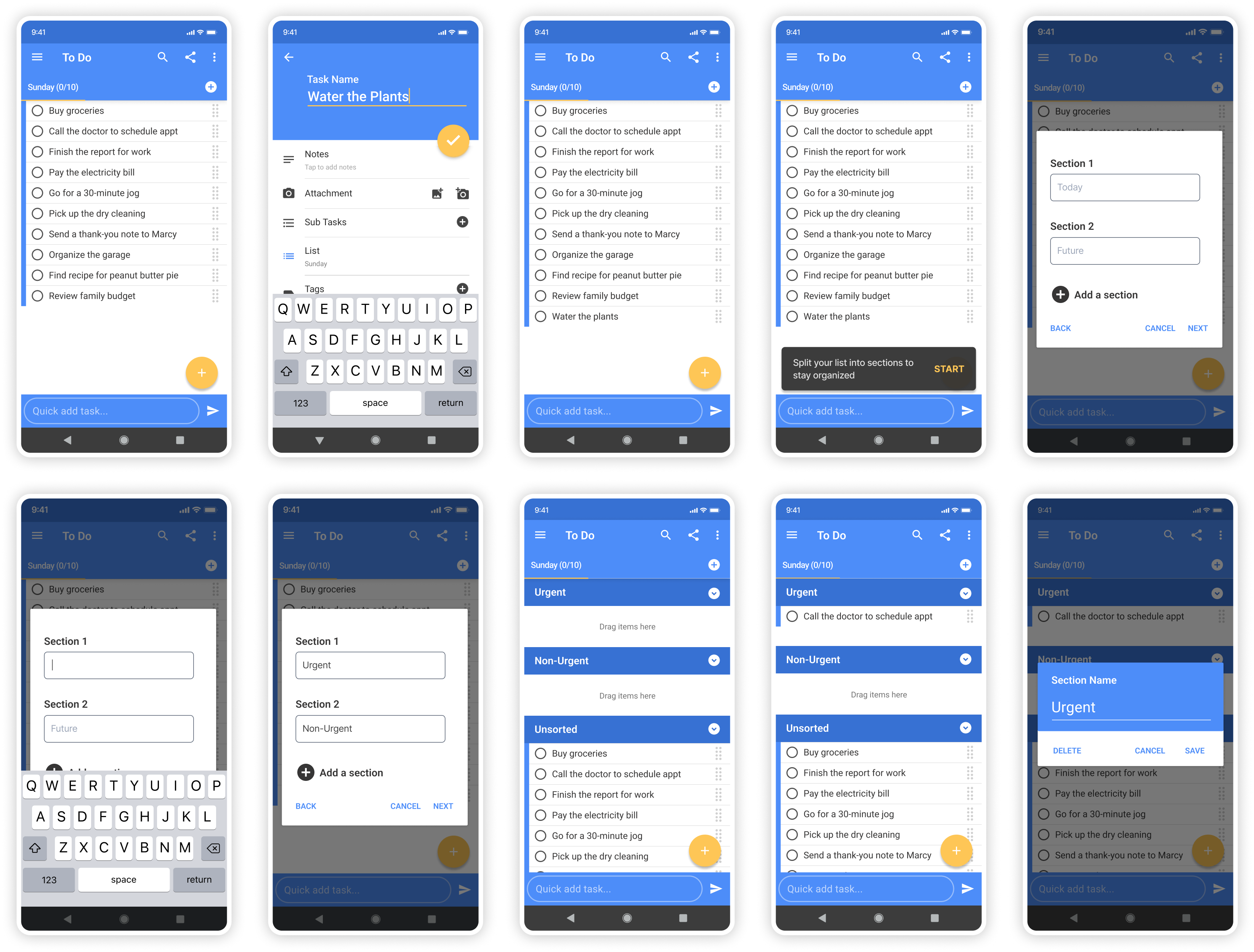
After conducting research, defining the problem, and brainstorming possibilities, I decided to design a new feature that prompts users to divide their list into smaller sections when their list is getting too long, making a clear visual indicator of their top priorities and which task to do next.
Letting Go of My Own Ideas
One thing I got to practice during this project was letting go of my own ideas. Instead of thinking about what feature I personally wished to add to the app, I tried to identify what feature most other users would find helpful. I wanted to make sure that my solution was based on research, not on guesswork.
Constraints: Working within an existing design system
Another challenge in this project was that I had to work within the app’s existing design system. I had to make sure that any colors, styles, functions, and new features added would match what the app already offered, to maintain a consistent user experience.
My Process

Research
The research process was exciting for me because I didn’t know yet which feature I would be adding. This was a pretty open-ended process and I was curious how things would turn out.
User Interviews: Defining the problem
I began my research by interviewing 5 people who had used to-do lists in the last month. (I was under a tight deadline, but I managed to find and interview 5 people within 24 hours!)
I wanted to understand:

How do people write their to-do lists?
How do people use their to-do lists?
What difficulties do they experience?
Key Insight: Users Want to Quickly See What’s Next
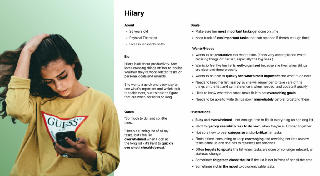
After finishing the interviews and reviewing my notes, I noticed a common theme: All interviewees felt that when looking at their to-do list, they need to quickly see which task to do next. (This is their “job to be done.”)
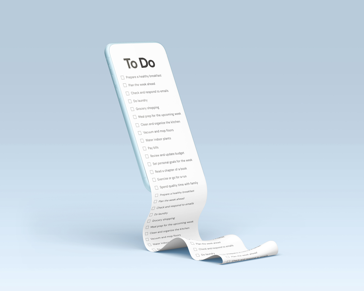
Why is this so hard? Because their lists keep getting longer and longer. When there are so many tasks on the list, it’s hard to quickly see which task to do next.
Breaking down the problem, I realized there are a few aspects to consider:
- The length of the lists
- The amount of tasks that users are allowed to add to each list
- The flow of what happens when users add a new item to the list (because that’s where we encounter the problem – they’re making the list too long)
“I make a to-do list every Sunday of my tasks for the week. I have my to-do list near me, and I keep going back to it to see what’s next.”
– Interviewee
“My to-do list is 3 miles long. I keep adding tasks! I have some priorities, but new things just keep coming up.”
– Interviewee

Problem Statement
Next, I wrote this problem statement from the persona’s perspective:
Hilary wants to prioritize items on her list so that she can quickly see which task to do next, but she has trouble prioritizing items on her list because her list is so long and every time she adds a new task, she has to reassess her priorities.
“How Might We...?”
I then wrote the following HMW question to kickstart the brainstorming process:
How might we help Hilary prioritize items on her list so she can quickly see which task to do next?
Ideate
Exploring other to-do list apps
To brainstorm solutions to this problem, I looked at other apps to see how they dealt with the issue of prioritization. Here are some of the things I found:
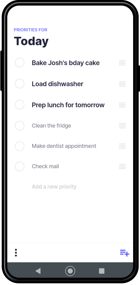
Priorities displays the top 3 tasks in a noticeably larger font. Users are limited to choosing only 3 priorities at a time. Lists are divided into “Today” vs. “Backlog.”
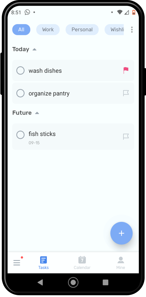
To-Do List divides your list into “Today” and “Future.” You can easily drag items to rearrange them between sections.
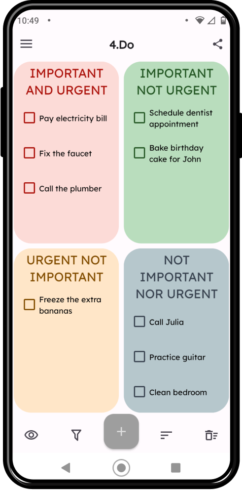
4.Do uses the Eisenhower matrix to organize tasks based on importance and urgency. The 4 quadrants make it easy to visualize which task fits where.
In short, I found that other apps were using certain features to help people prioritize their lists, which the Tasks app does not currently offer:
- Give a clear visual indicator of which tasks are priorities. (The Tasks app communicates priorities with a very small change of color, which not so easy to see at a glance.)
- Divide your list into subsections. (While the Tasks app lets you create new lists, it doesn’t let you see one list divided into sections.)
- Limit the amount of tasks you can mark as priorities. (The Tasks app has no limit] to how many items are marked as priorities.)
With these points in mind, I brainstormed what kind of new feature I could add to the Tasks app to help people quickly see what tasks to do next.
My Idea: Prompt Users to Divide
Since my research showed that the problem starts when users’ lists get too long, my idea was to:
- Prompt users to divide their list as soon as they have added 10 times. This would prevent their list from getting too long.
- Let users divide their list into subsections. The app could suggest “Today” vs. “Future” as the default sections titles, but users could customize the sections if they wish. This would offer a clear visual indicator of which tasks they need to take care of today, and which tasks can wait.
Although many to-do list apps suggest (or even force) users to divide their lists into “Today” vs. “Future,” I didn’t want to force my users to do that. While conducting interviews, I noticed that 3/5 people said they like to divide their lists by “Big Tasks” vs. “Small Tasks.” So although “Today vs. Future” would be a suggestion, I wanted to let users customize their section titles if they prefer.
Diagramming the Task Flow
Next, I wrote out a task flow to clarify the experience of how the user would be able to prioritize in this way.
Sketches and Realizations
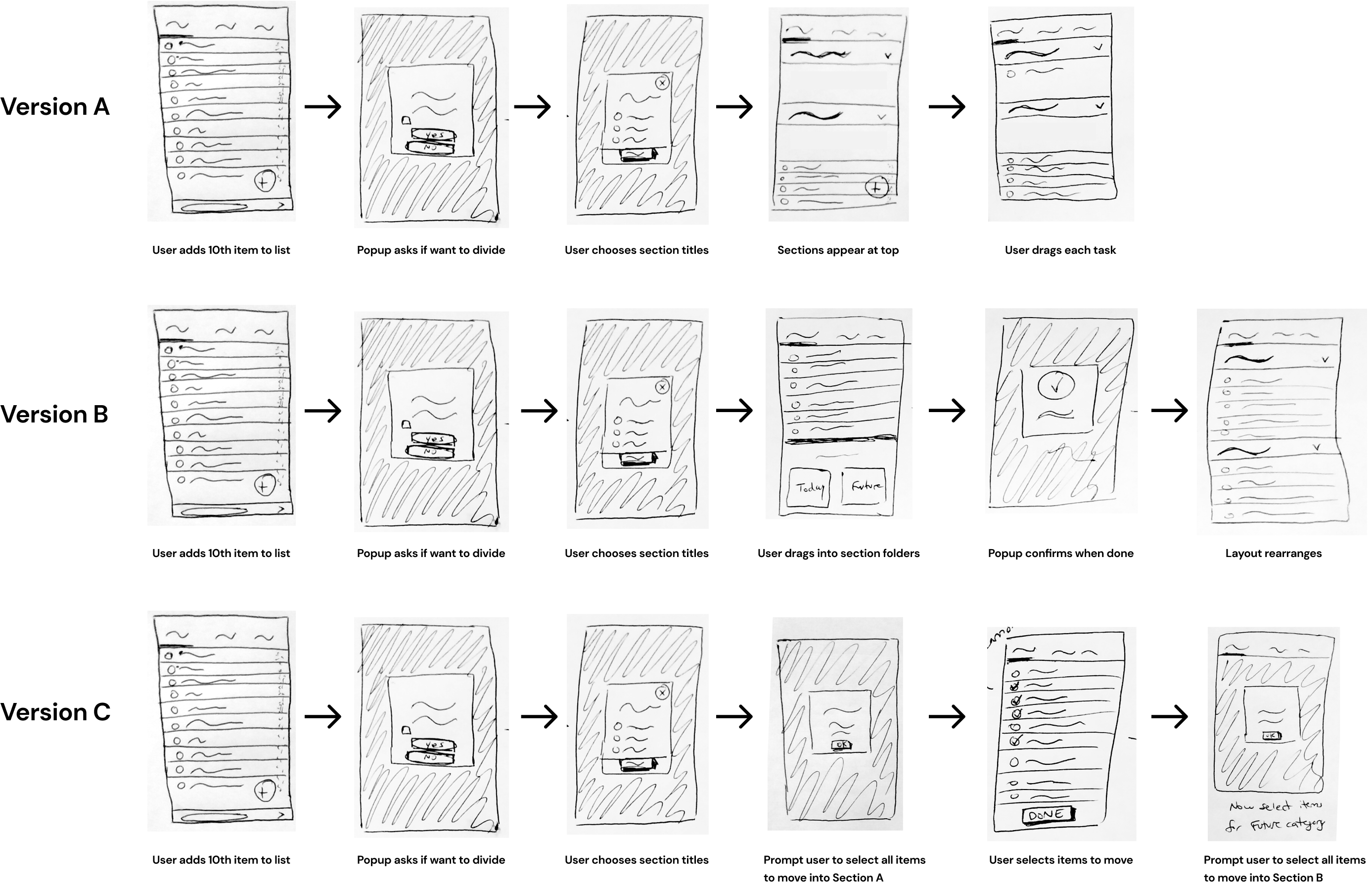
Next, I sketched out some different possibilities of how the layout might look. I explored a few alternative options, including the possibility of letting users select items via checkboxes and then move them all at once (rather than dragging and dropping them one by one).
Insights From My Sketches
In the process of drawing these sketches, I realized:
- Better to put the new sections at the top of the list because if they’re at the bottom of the screen, they may get cut off.
- Better to let users drag and drop instead of selecting tasks with checkboxes, because checkboxes are too similar to the “mark as complete” function.
- Better to make the sections stacked vertically instead of side-by-side, to minimize changes in the layout (which may confuse the user).
Prototype
Once I had decided to go with “Version A” from my sketches, I created the screens needed for this flow on Figma.
I really enjoyed designing these screens because I’m very detail-oriented, so I love the challenge of trying to replicate a design and making everything pixel-perfect.
When creating these screens, I had to adhere to the apps’ existing design system to maintain a consistent user experience.
Here’s how I originally designed the screens for this flow:
Yellow - Noticed Accessibility Issue
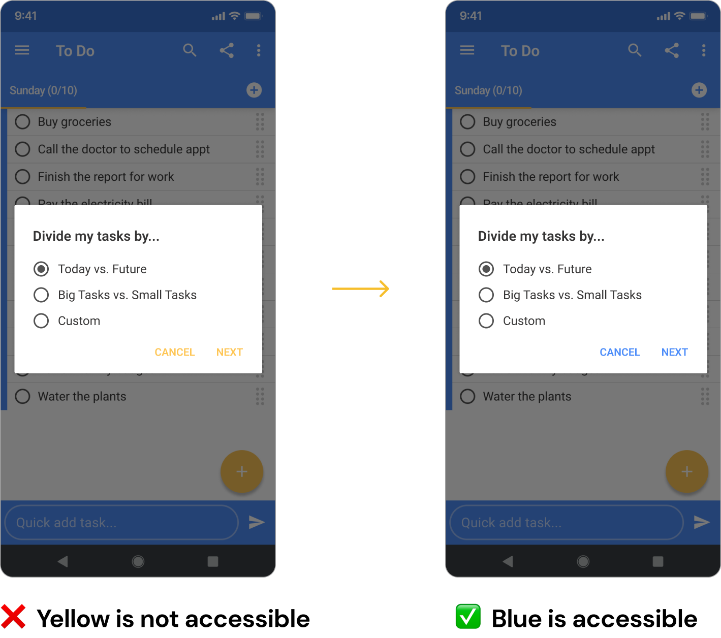
While working on these designs, I noticed that that app always uses yellow text for links, but the yellow text fails to meet accessibility standards on a white background.
So I took the initiative to change the yellow text to blue, for the sake of this project. If I were working with the Tasks app’s team, I would definitely alert the team that this accessibility issue has to be fixed to ensure a user-friendly and inclusive interface.
Pop-Ups Can be Jarring
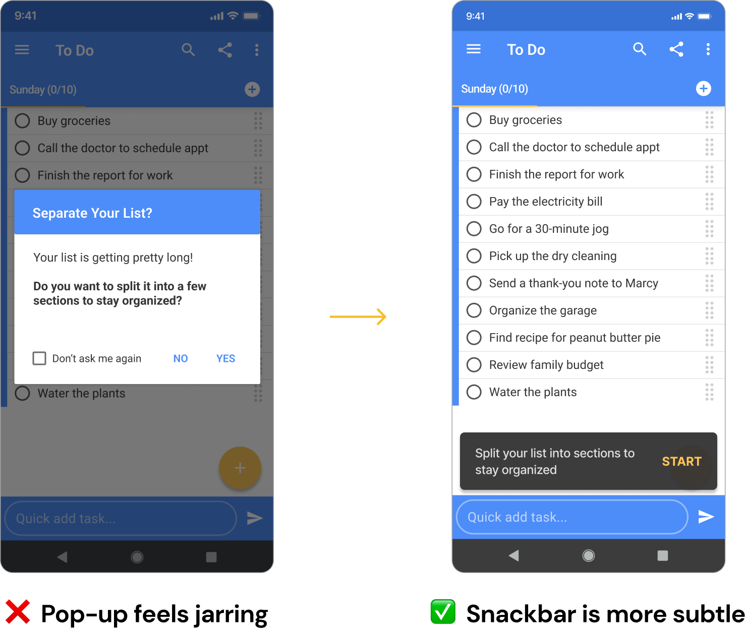
Next, I tested my prototype in Figma. While going through the flow, I realized that seeing a pop-up was jarring and a little annoying. So I decided it would be better to switch the pop-up to a snackbar instead.
Testing
With my newly updated prototype ready, I tested my new feature with 4 participants via Zoom screenshare.
What Went Well
Overall, people were able to navigate the app easily, and they appreciated some of the features I had included to help them stick to their goals.
“It’s helpful to have a visual indication of what’s a priority, instead of having to keep it in my head.”
– Usability Test Participant
“I like being able to drag tasks into different sections, instead of having to delete and retype them in the correct place.”
– Usability Test Participant
Iterations
There were 3 main issues that came up during usability testing, so I fixed these before designing the final prototype:
- Added “Add Sections” to the menu because 1 user pointed out there was no way to add sections later, after going through the main flow.
- Removed the multiple choice options about how to divide the list, allowing users to type custom section titles from the outset instead because 2/4 people felt the multiple choice options were unnecessary, and they prefer to do it all in 1 step.
- Added an additional way to remove sections (by tapping on the section titles) because 2/4 people took a few seconds to figure out where to find the “Remove sections” button in the menu.
Final Mockups
Concluding Thoughts
This was a fun project that I enjoyed working on, because I love thinking about to-do lists and how to maximize productivity.
If I would have had more time to work on this project, I would have liked to test my prototype with users who are already familiar with the Tasks app.
This is because:
- I would want to make sure that the way my new feature works is intuitive, within the context of the rest of the app’s functions.
- I wonder if adding this feature would be a worthwhile investment, given the time and money involved in having developers add new features. The Tasks app already offers ways to make different types of lists (main lists, sublists, and subtasks), so I wonder if existing users would still find it helpful enough to visually divide their list into sections with this new feature.
Lastly, if I was working with the Tasks app’s team, I would definitely make recommendations about how to improve some elements of their UI, such as changing the yellow text which is not accessible, and changing the placement of some of their buttons to make them more intuitive.
Thanks for reading!
Want to talk? Let’s connect and explore how I can help your business provide clear, easy, and delightful digital experiences for your customers.

